Designing a monetization system for partner offers
Designed an end-to-end monetization system — from seasonal campaign triggers to structured offer selection and partner conversion.
ROLE
PROBLEM
Design problem
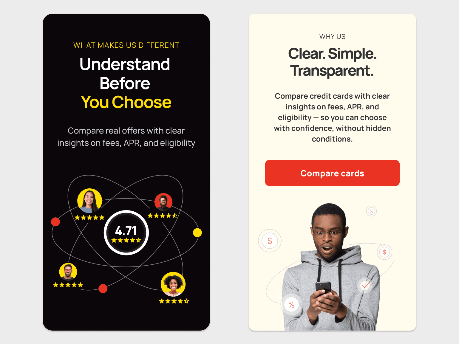
There was no clear way to compare offers or choose the right one. The experience felt messy, with no prioritization or consistent structure, and wasn’t built to scale across campaigns.
Business problem
Users didn’t know which offer to pick and took too long to decide. This slowed down conversions and made it harder to promote the right offers and bring users back.
RESULTS
+35% increase in CTR from campaign entry points
+22% increase in offer selection rate
+18% growth in repeat visits from re-engagement channels
Improved user confidence in choosing the right offer
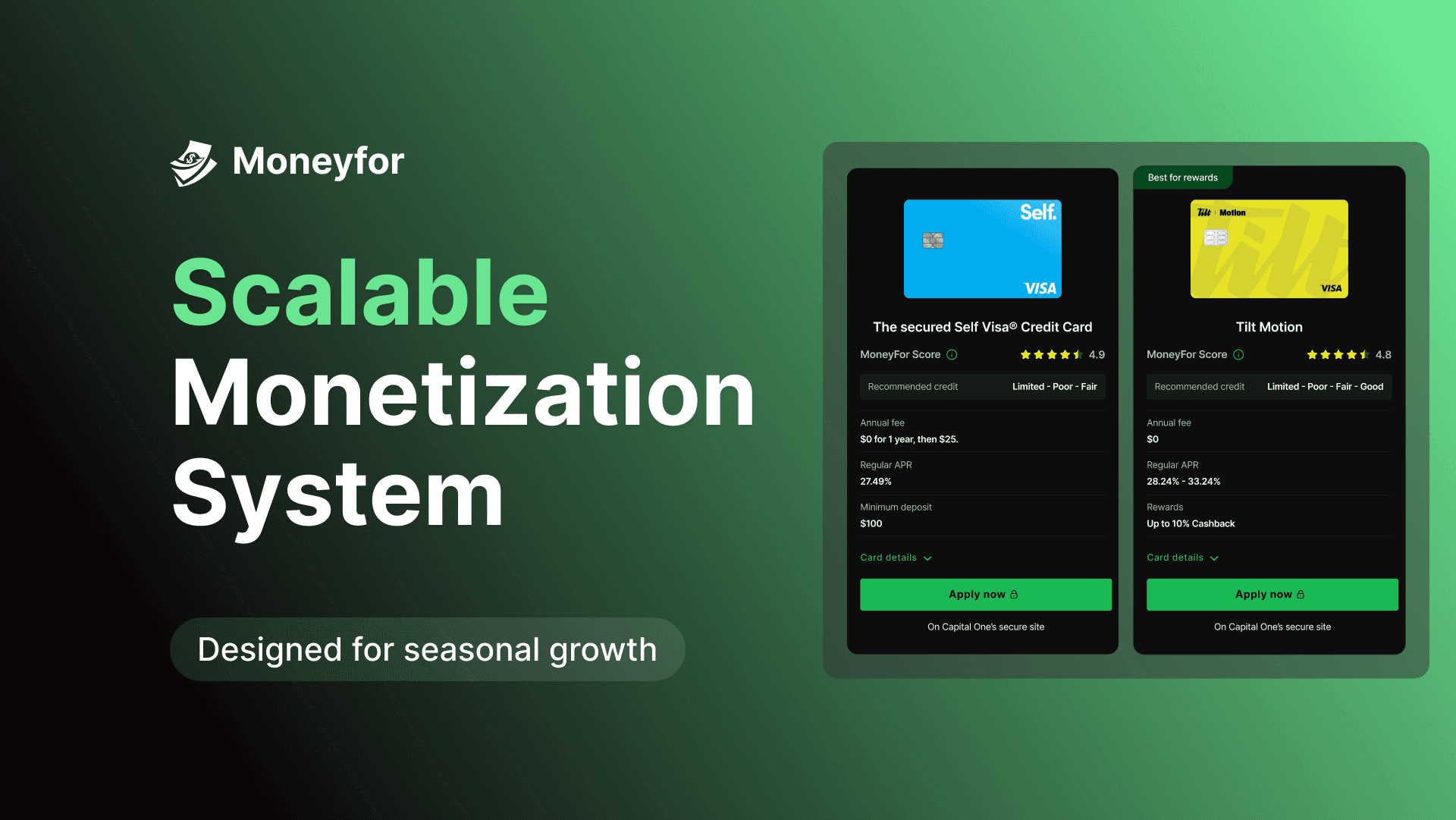
End-to-end monetization system
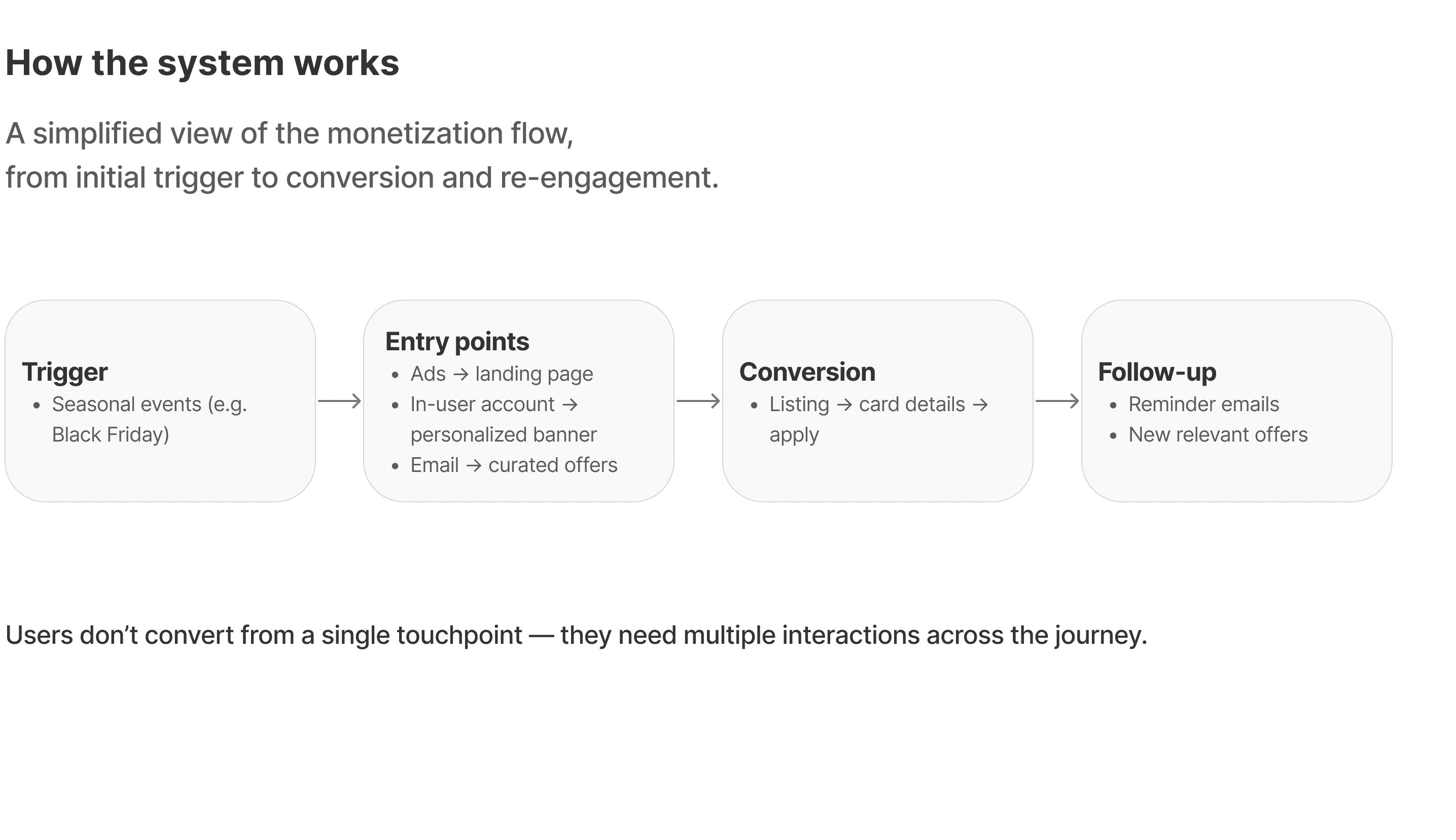
From trigger to entry points
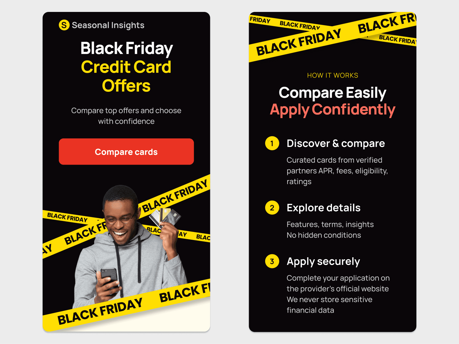
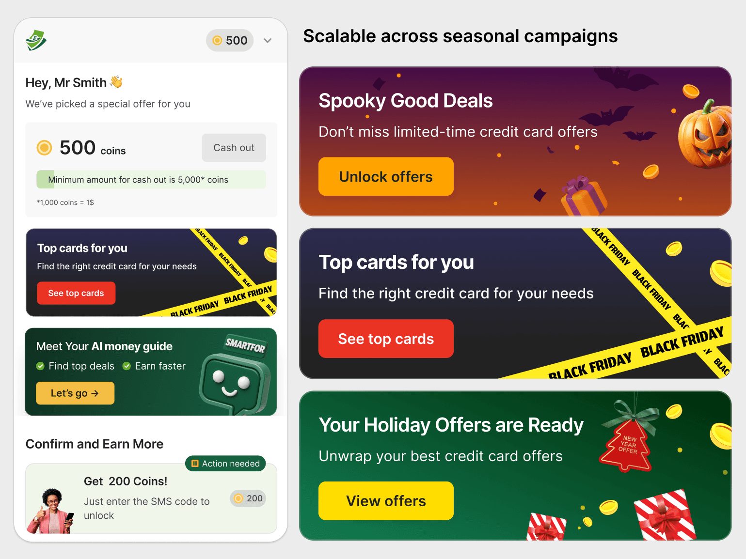
Users enter the flow through seasonal campaigns (e.g. Black Friday). Traffic is distributed across multiple entry points — ads to landing pages, emails with curated offers, and in-account personalized banners.
From landing to offer selection
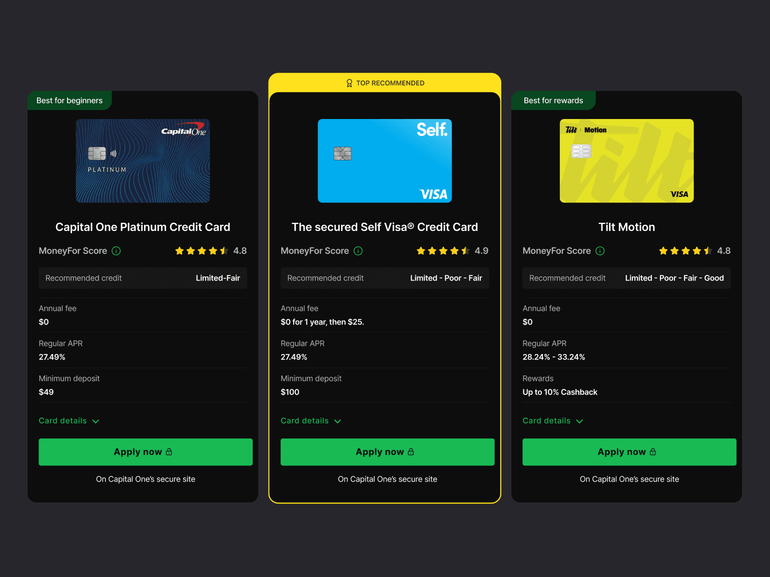
Users land on a curated listing of credit cards, compare key details, and choose an offer to continue on the provider’s site.
Bringing users back into the flow
Users who don’t convert are re-engaged through reminder emails and new relevant offers, creating multiple opportunities to return and complete the flow.
This created a repeatable system that can be reused across campaigns and scaled over time.

Activation & conversion experiments
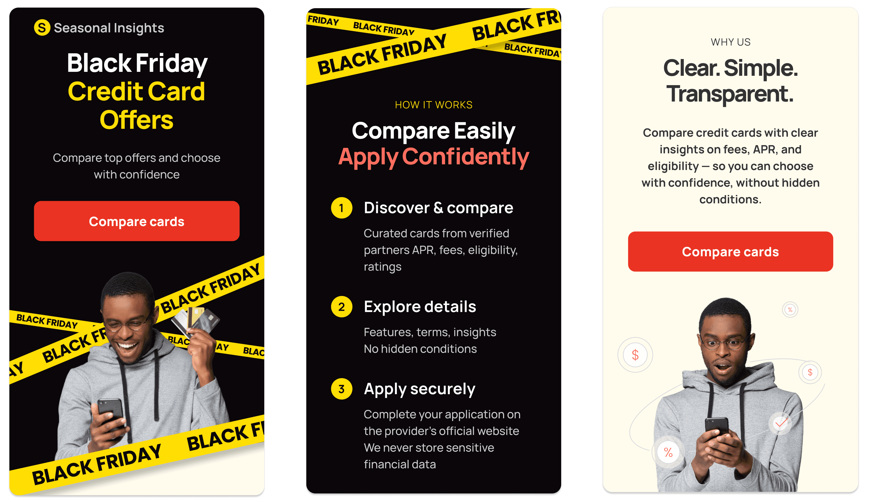
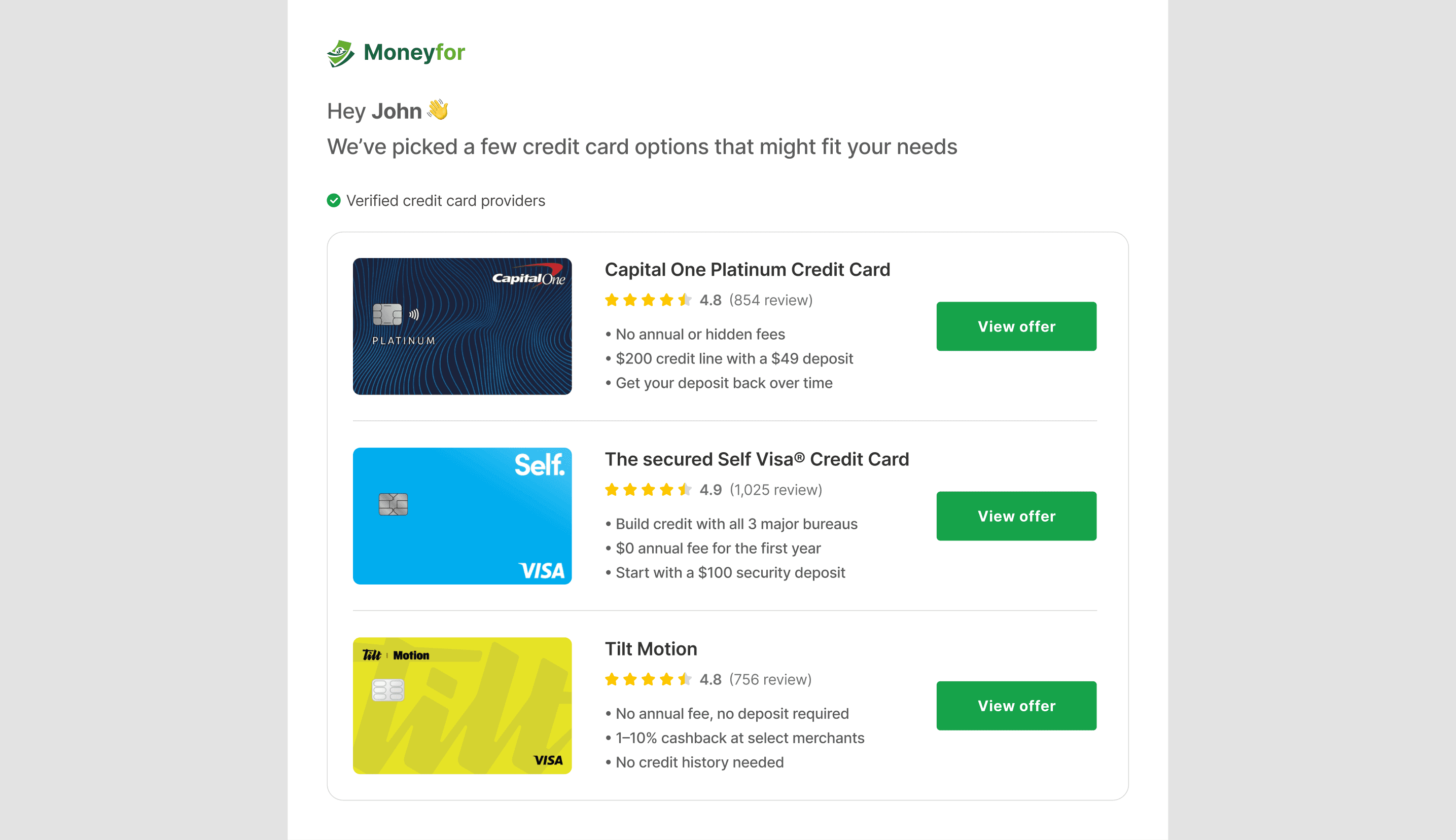
Re-engaging users through seasonal email
Users who didn’t interact with the product are reactivated through email campaigns featuring curated credit card offers. This creates an additional entry point into the flow and brings users back with relevant, time-based value.
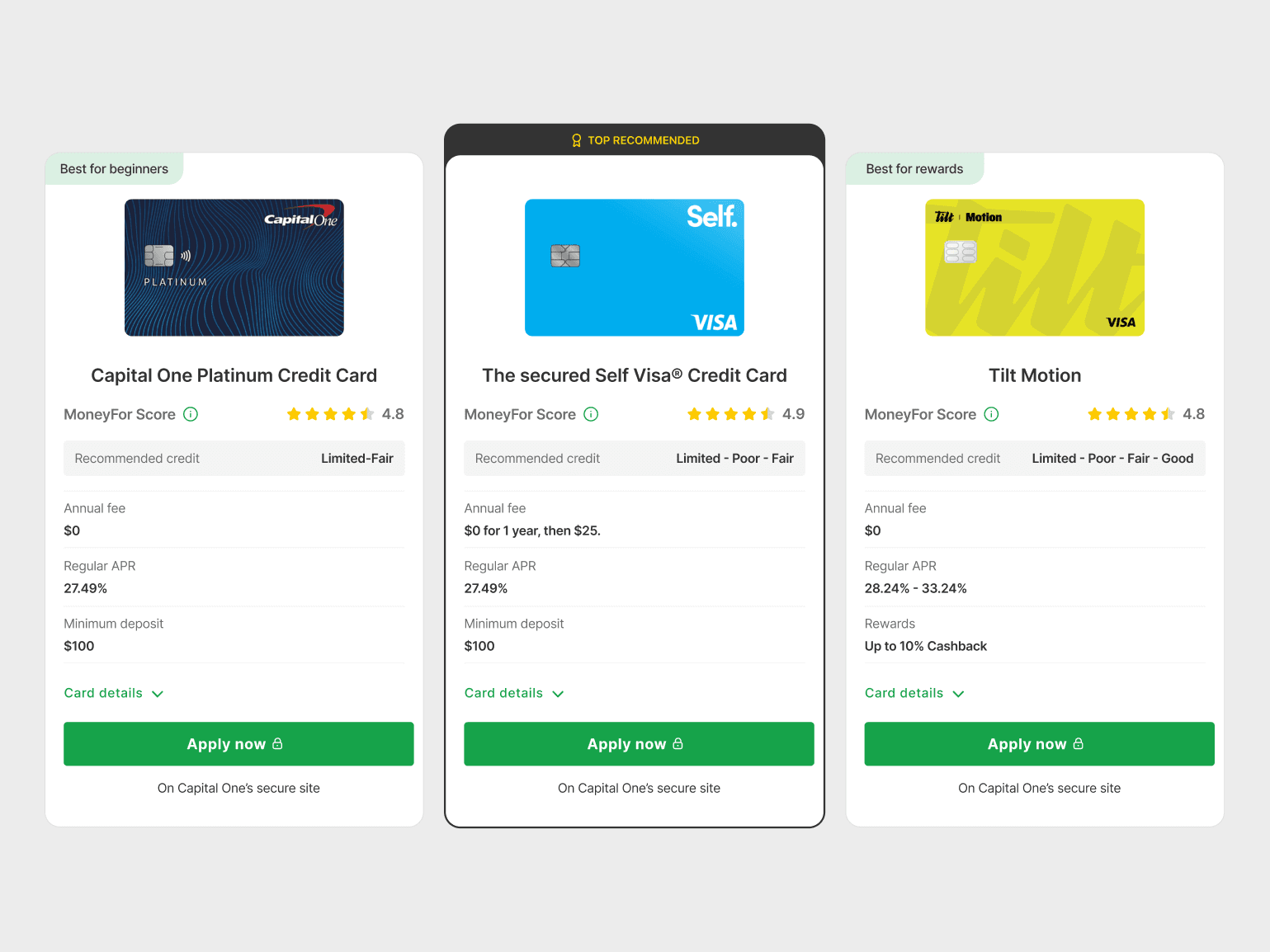
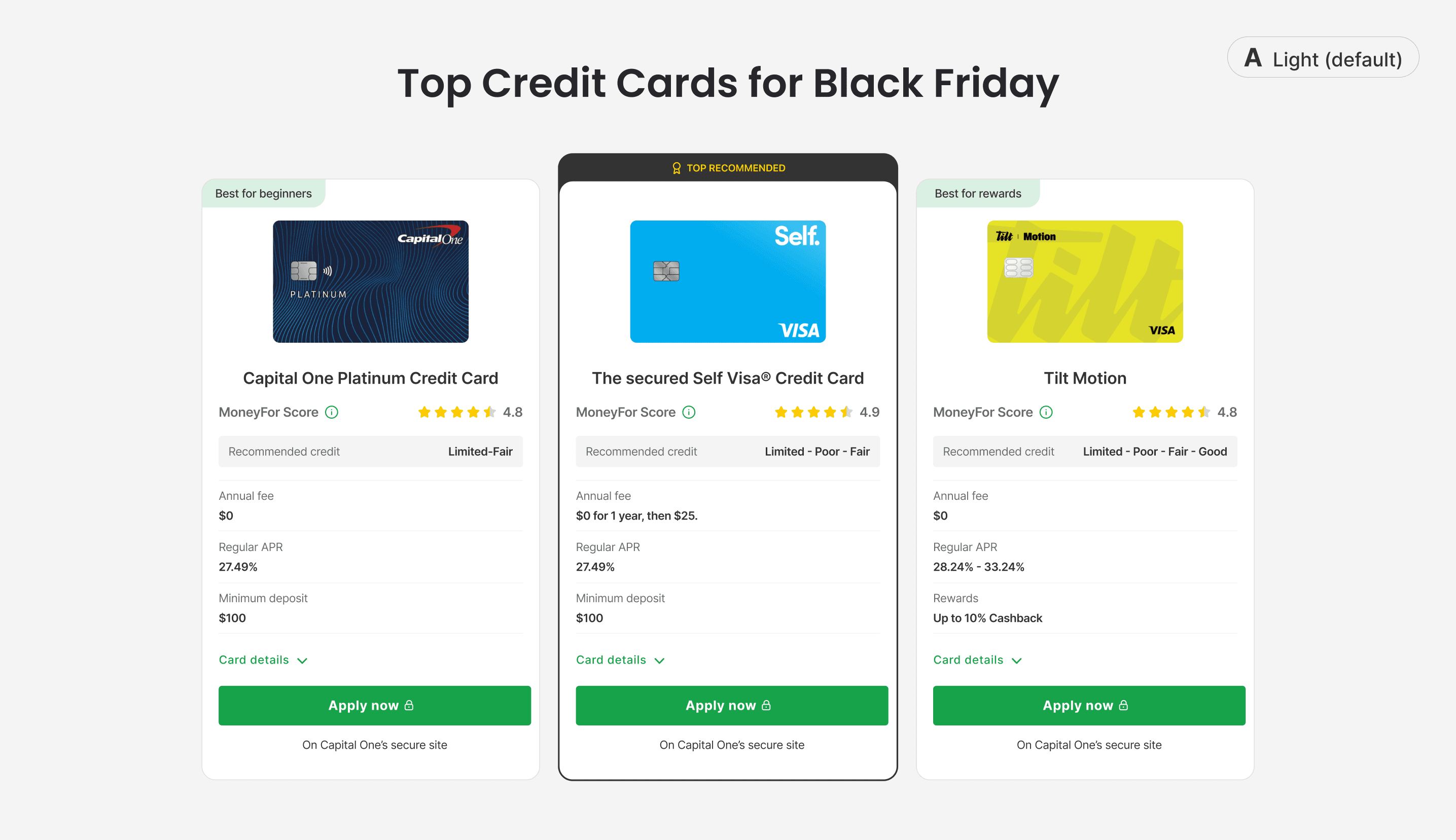
Guiding users with a recommended offer
The listing is designed to simplify decision-making by highlighting a recommended card. This reduces choice overload and helps users quickly identify the most relevant option before proceeding.
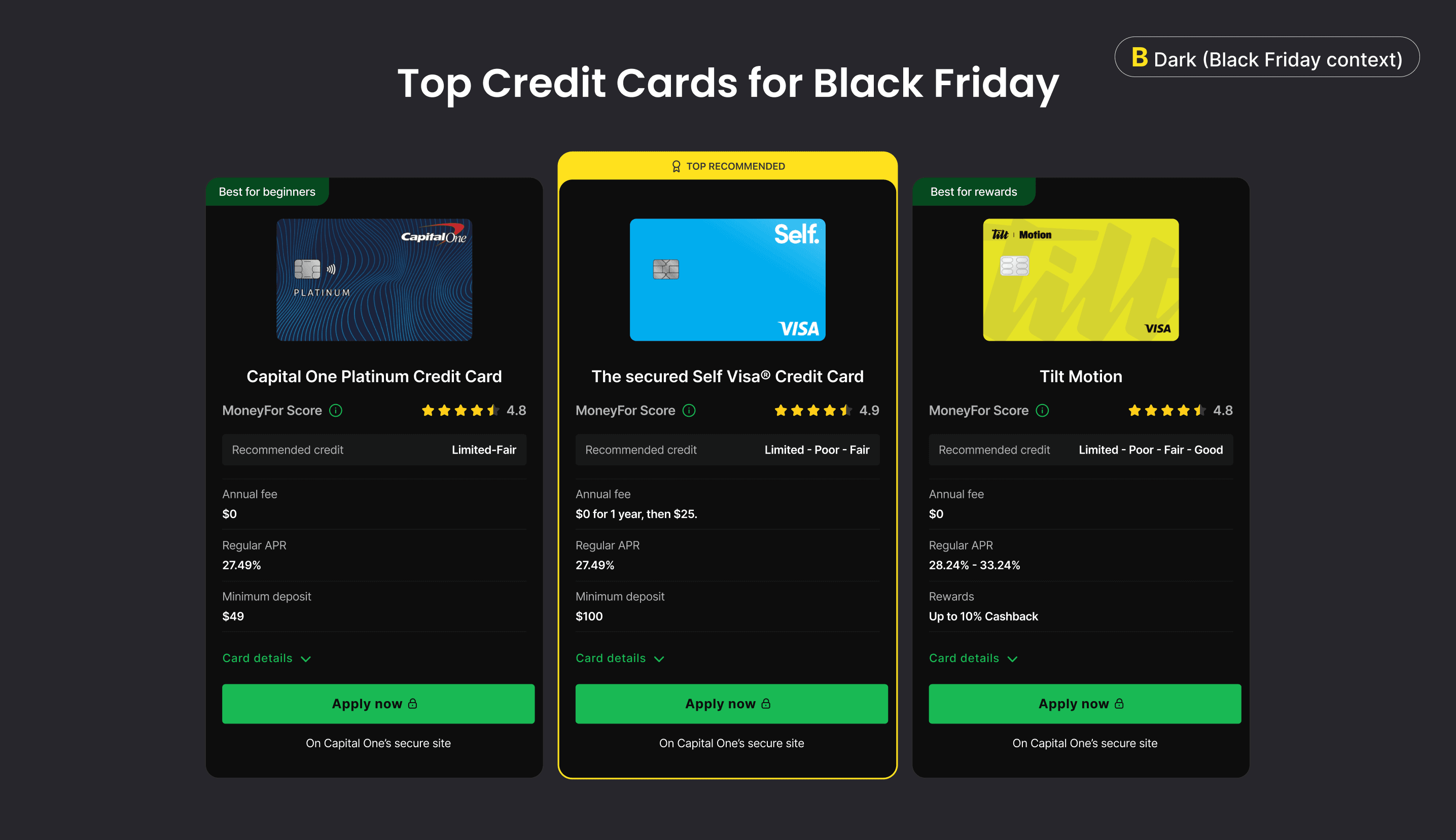
Testing seasonal visual context
We explored a dark theme aligned with Black Friday to increase contrast and focus on key offers. The experiment compares default and seasonal variants to evaluate impact on engagement and clicks.
AI-assisted iteration.
I used AI tools to quickly explore variations, analyze competitors, and test different messaging and layouts. This helped speed up decision-making and scale experiments across campaigns.
We tested multiple approaches to improve engagement and conversion across the flow.
Performance outcomes
By introducing a structured system for comparing and prioritizing offers, we reduced decision friction and made it easier for users to choose the right option.
This led to a 35–40% increase in click-through rate across campaigns, along with higher offer selection and repeat visits.
The system was designed to scale, allowing us to reuse the same patterns across seasonal campaigns while maintaining consistent performance.